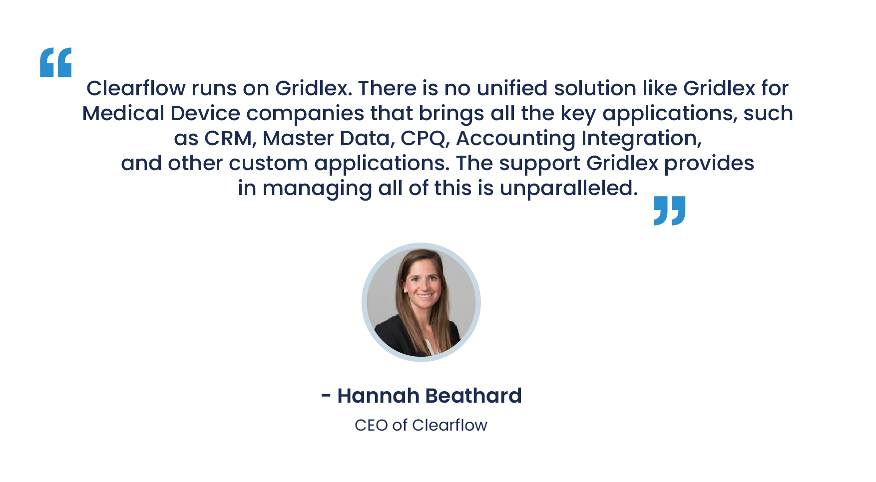
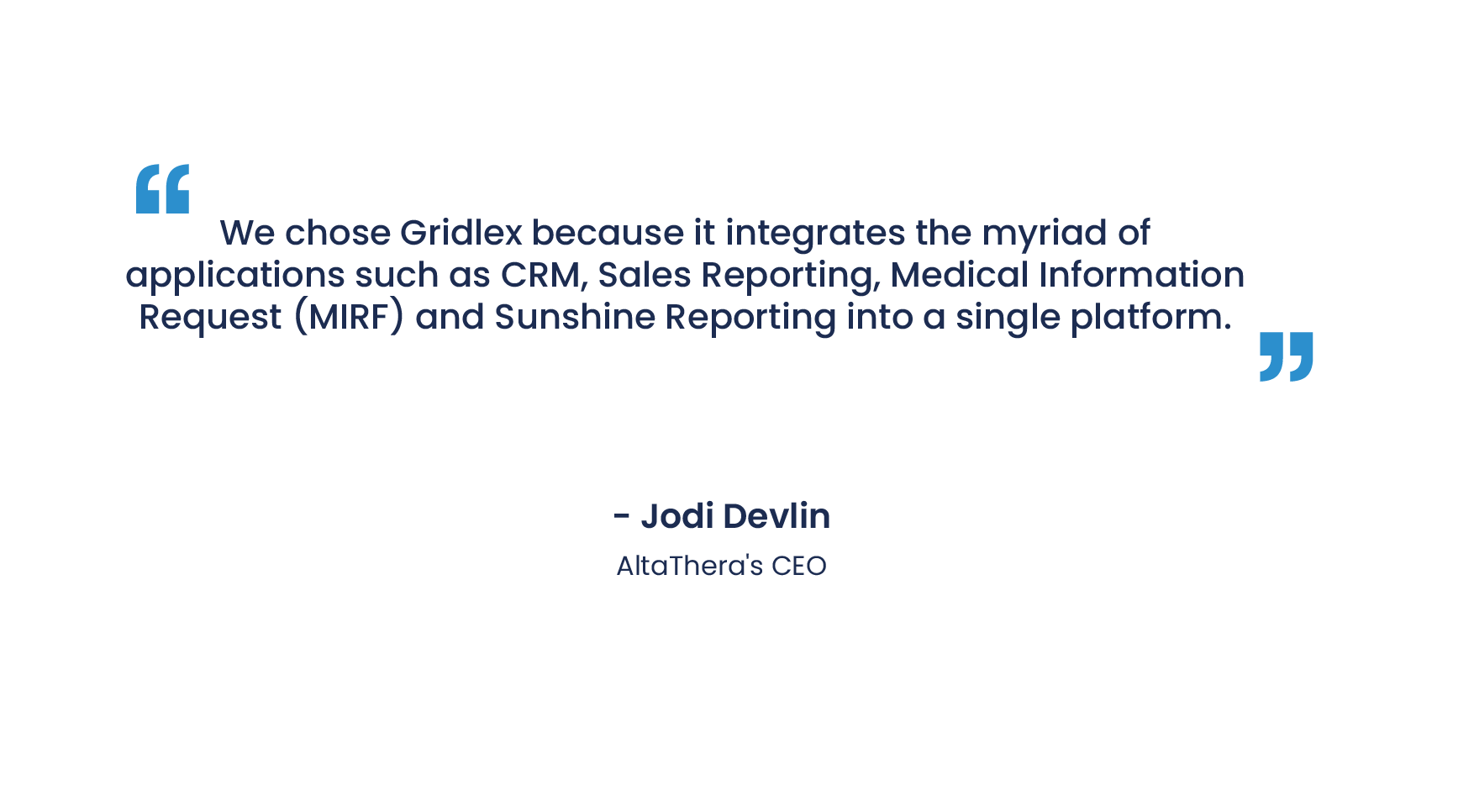
Data Visualization for Non-Technical Professionals: Simplifying the Process

Data Visualization for Non-Technical Professionals: Simplifying the Process

Posted In | Dashboard, Reporting & Analytics

Data visualization is an increasingly essential tool in today's data-driven business landscape. By translating complex data sets into understandable and interactive visual formats, data visualization simplifies the decision-making process, making it accessible to professionals across different disciplines, including those without a technical background. This article aims to simplify the process of data visualization for non-technical professionals.


dashboard-reporting-and-analytics-image

1. Understanding Data Visualization

Data visualization is the process of graphically representing data or information. It involves using visual elements like charts, graphs, and maps to convey complex information clearly and efficiently. By using data visualization, we can discern patterns, trends, and insights in data that might not be immediately apparent in raw, text-based data.


2. The Importance of Data Visualization for Non-Technical Professionals

Non-technical professionals often find it difficult to extract meaningful insights from raw data, especially when the data set is large and complex. This is where data visualization comes in handy. It enables these professionals to comprehend the information by providing a visual, often interactive, representation of the data. This simplifies the process of interpreting the data, making it easier to identify patterns and trends, make comparisons, and understand complex data sets.


3. Simplifying the Process: Tools and Techniques
 

1. Use the Right Tools

Various data visualization tools are designed to be user-friendly, even for non-technical users. Tools like Tableau, Microsoft Power BI, and Google Data Studio offer intuitive interfaces and drag-and-drop features that make it easy to create compelling visualizations. Additionally, these tools often come with pre-built templates and tutorials, further simplifying the process.
 

2. Start with Simple Visualizations

When starting with data visualization, it's essential to begin with simple forms, such as bar charts, line graphs, or pie charts. These basic visualizations are easy to create and understand, making them a good starting point for non-technical professionals.
 

3. Understand Your Data and Audience

Before creating a visualization, it's crucial to understand the data you're working with and the audience for whom the visualization is intended. What information is the data conveying? What insights do you want to highlight? What does your audience need to understand from the data? Answering these questions will guide the creation of a useful and impactful visualization.
 

4. Apply Best Practices in Data Visualization

There are several best practices in data visualization that non-technical professionals can easily apply. For instance, always label your axes, use a legend to clarify different data points or categories, choose color schemes carefully to make sure they're readable, and avoid overcrowding your visualization with too much information.


Data visualization offers an effective way for non-technical professionals to interpret and communicate complex data. By utilizing user-friendly tools, starting with simple visualizations, understanding the data and audience, and applying best practices, these professionals can simplify the process of data visualization and unlock the value of data in their roles. As the importance of data continues to grow in the business world, gaining proficiency in data visualization will become an increasingly valuable skill, regardless of one's technical background.